Shading a face can feel like a mystery at first-but once highlights and shadows click, it’s like your drawing suddenly levels up.
What are highlights and where do they go?
When coloring or shading a face, highlights are the areas where light naturally hits the skin. These spots appear brighter and help the face look more three-dimensional and lifelike. Think of them as the “glow zones” where your coloring really comes to life.
What Are Highlights on the Face?
When coloring or shading a face, highlights are the areas where light naturally hits the skin. These spots appear brighter and help the face look more three-dimensional and lifelike. Think of them as the “glow zones” where your coloring really comes to life.
Where to Place Highlights (Front View)
In a front-facing face, the most common highlight areas are:
Forehead center – usually between the brows or slightly above, where light hits the tallest part of the forehead
Bridge of the nose – a gentle line running down the nose to suggest a light source above
Cheekbones – the tops of the cheeks near the outer corners of the eyes, great for that subtle glow
Tip of the nose – gives the nose form and dimension
Cupid’s bow – the little dip above the top lip
Chin center – catches light and balances the highlight at the top of the face
Bonus: If the person has glossy skin, is wearing shimmer makeup, or you’re working in a stylized style (like anime or surrealist), you can also add small highlights to:
Shadows are the areas where light doesn’t directly hit the skin—these darker zones help define the shape of the face and add important depth and realism to your artwork. Think of shadows as the sculpting tool that gives your drawing structure.
Where to Place Shadows (Front View)
When coloring a face from the front, typical shadow zones include:
Sides of the face – particularly along the jawline and near the temples
Under the cheekbones – this creates definition and a soft contour effect
Sides of the nose – adds dimension to the bridge and defines the nose shape
Eye sockets and crease lines – especially under the eyebrows and beneath the eyes
Below the lower lip – helps the lip stand out and shows subtle chin depth
Neck and under the chin – one of the darkest areas when lighting comes from above
Bonus: If your light source is dramatic (e.g., off-center or from below), adjust the shadows accordingly to reflect that mood. For stylized portraits, you might exaggerate shadows for a more graphic or dreamy effect.
Let’s Review it
Final Thoughts
Understanding where to place highlights and shadows is like turning on the lights in your drawing—it brings your characters to life and adds that extra touch of magic. Whether you’re coloring with markers, pencils, or digital tools, remember: it’s not about perfection—it’s about practice and play.
Ready to give it a try? Download the free practice face sheet. Grab your favorite colors, and let’s color with confidence!
So next time you sit down to color a face, try thinking like a sculptor with light. Look for the glow zones and the shadow pockets, and let your colors do the storytelling.
Once you’ve picked your perfect skin tone, it’s time to bring it to life with highlights and shadows.
Creating Highlights
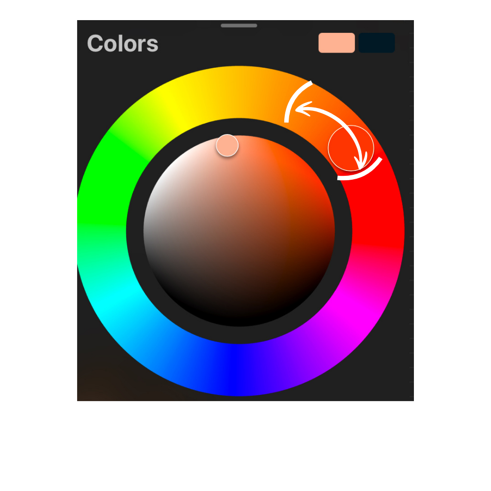
Highlight Trick: Tap your base color in the color picker, then gently drag it up and to the left—toward yellow or pink—for a warm, natural glow. Think of it like drawing a tiny upside-down “L” with your finger. That’s your shortcut to radiant highlights!
Need more warmth? Spin the outer color wheel dial to boost saturation and really make that skin tone shine.
Creating Shadows
Shadow Time: Select your base color again, but this time drag it down and to the right. You’ll see the color deepen beautifully—hello, instant depth and dimension.
Once you have all you skin tones created you can now add them to your character.
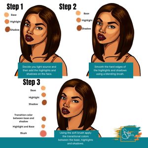
Step 1: Find your light source and then add the base first and then the highlights and shadows.
Step 2: With a blending brush-I use a standard blending brush download here.. You can blend out the hard edges of the shadows and highlights.
Step 3: Create a new layer and then move the colore picker between shadow and base to create a transitional color. Use a soft brush to over over where the shadow and base connect. Do the same with the highlights and the base skin tone.
Step 3:
You’ve officially unlocked the power of light and shadow, Shayla! By learning how to craft highlights and shadows from your base skin tone in Procreate, you’re not just adding color—you’re adding dimension, personality, and depth to your characters. With just a few shifts in the color picker and a little intentional layering, your portraits can go from flat to full of life.
Keep practicing with different undertones and lighting styles to build a palette that works for you.
One of the first things to learn when it comes to your art journey is the understanding of color theory.
Color theory is the technique use to create combinations of colors.
Before we dive deeper let’s go over colors.
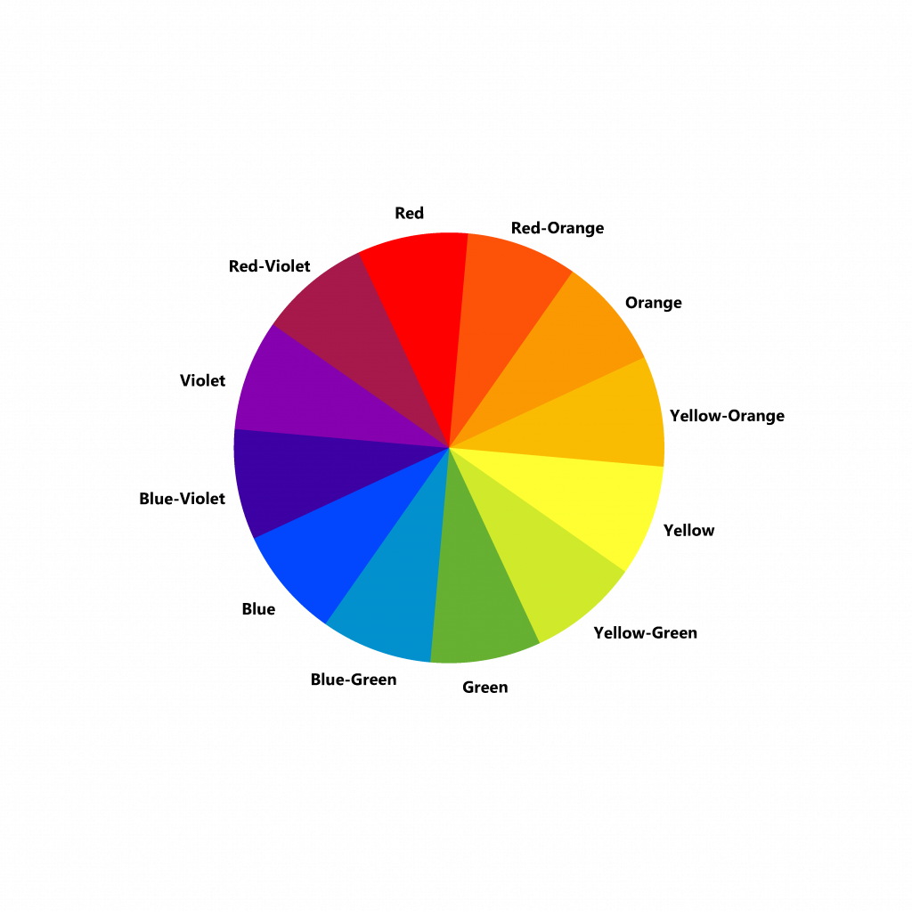
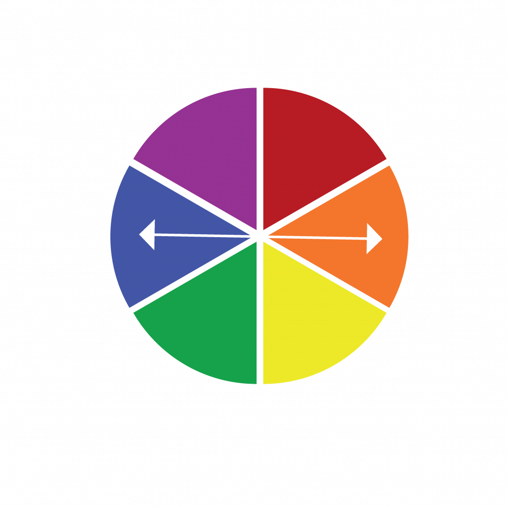
Primary Colors consist of red, yellow and blue. These colors are considered primary because they can not be created by mixing other colors.
Primary Colors on the color wheel
Secondary colors are green orange and purple. They are created from the combination of red, yellow and blue.
Secondary Colors
When all of the six colors are combine they make a color wheel.
Now that we have a color wheel consisting of primary and secondary colors, we can now expand on this by learning about the relationship between the colors.
Tertiary Colors
Tertiary colors expand on the color wheel because they are colors that are mixed from primary and secondary colors.
Yellow Green would be a tertiary color because it is created when mixed with yellow and green
Complementary Colors
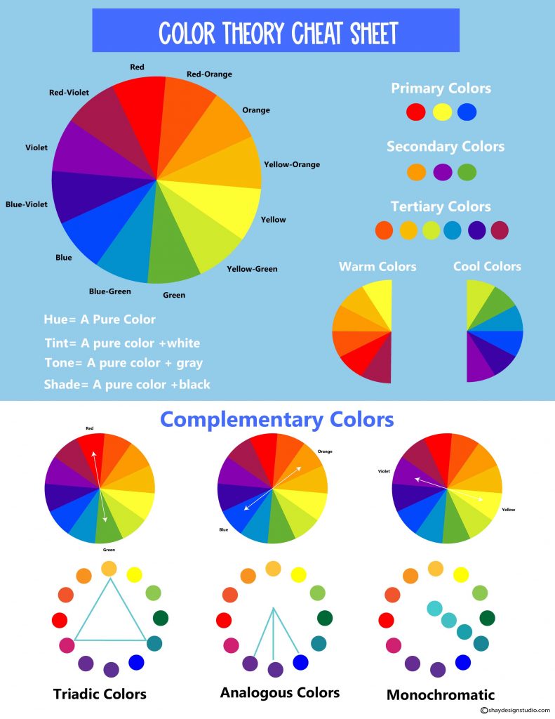
Complementary colors site directly opposite from each other on the color wheel. For example, orange is opposite of blue so they complement each other. Understanding complementary colors is also great to understand especially when it comes to painting. When it comes to complementary colors if you were to mix them they would mute each other or turn brown. Brown is a beautiful color but if you are trying to create a color that isn’t brown it’s best to mix colors that aren’t complementary of each other.
Triadic Colors
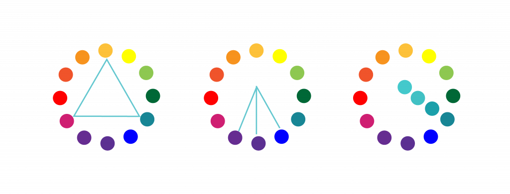
Triadic colors are colors that are evenly spaced around the color wheel. Figure 1 shows that orange-yellow, green-blue and red-purple are evenly spaced around the color wheel.
Figure 1 Figure 2 Figure 3
Analogous Colors
Analogous colors sit next to each other on the color wheel. In figure 2, blue, blue-purple and violet are right next to each other.
Monochromatic Colors
Monochromatic colors are color schemes that consists of a variation of a colors, tint, shades and tones. In figure 3, you can see how blue-green changes once white, gray and black is mixed with it.
Tints is a color mixed with white.
Tones are colors mixed with gray.
Shades are colors mixed with black.
Color Temperature
Colors can be compared to temperatures. Red, orange often represent warmth so they are considered warm colors.
Blues, greens and purples are cool colors.
Get your copy today!
Color theory is the technique of understanding colors and how they work with one another. There are primary colors that include red, blue and yellow. These colors cannot be created from mixing colors. Secondary colors are colors that are made from the mixture of red, blue and yellow.
Colors can be complementary of one another, triadic and monochromatic. They are even compared to warmth and cool colors.
I know this may be a lot to take in so I have created a color theory cheat sheet that you can download here.
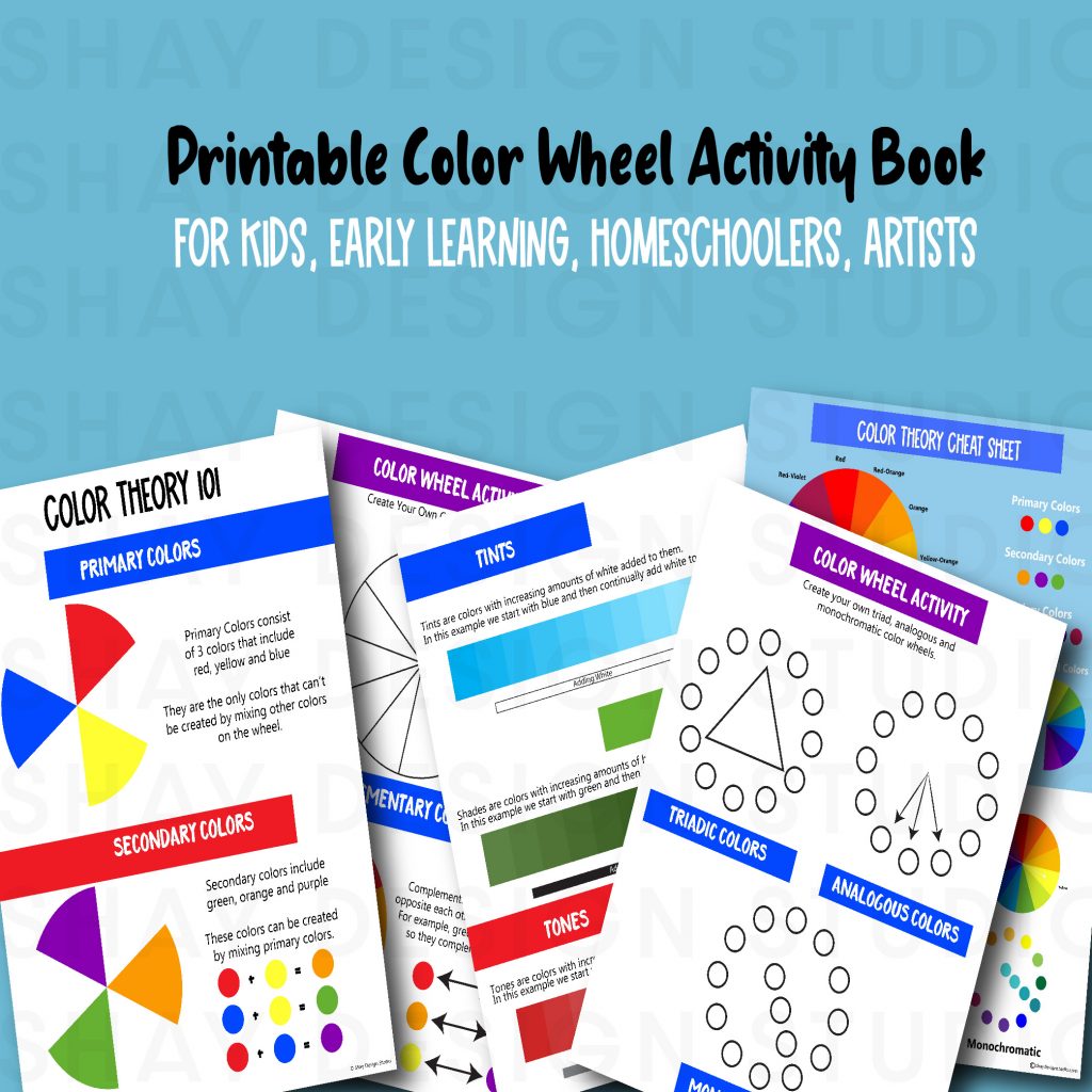
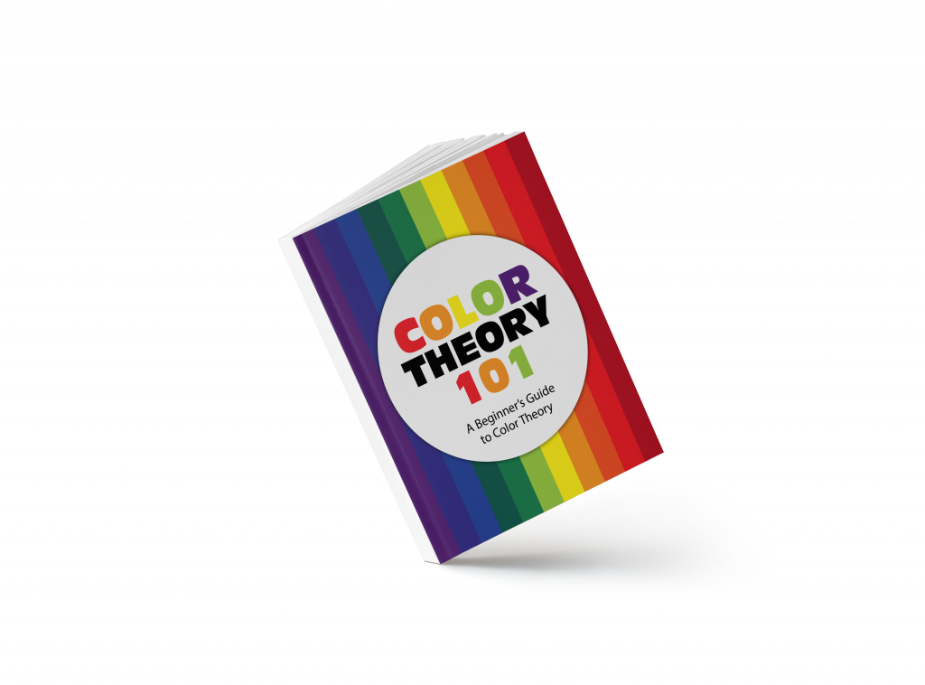
Would you like to learn more about color theory. Check out the color theory 101 workbook. A 15 page interactive workbook that goes over primary, secondary and more. Get your printable copy by clicking on the images below.
Color Theory 101 Interactive Workbook now available on the shop page!Color Theory 101 Workbook
Celebrate Valentine’s Day with even more coloring fun with the Valentine’s Day Coloring Page Bundle.
Are you looking for more Valentine’s Day fun? Check out the Valentine’s Day Printable Coloring Pages Bundle.
The Bundle includes 3 printable 8.5X11 inches black and white coloring pages and 3 4.5X3.5 inch drawing cards of the same 3 pages. Great for kids, adults and couples looking to create a DIY valentine’s gift for one another! Purchase yours today by clicking the link below!
Creative Market is a hub of ready-made fonts, templates, SVG files, and more!
The website also offers Free Fonts in exchange for signing up to their platform.
Every week, Creative Market has what they call “Free Goods.” The Free Goods tend to be a weekly pack of products that include fonts, illustrations, templates, and more.
If you are a font junkie like myself, you will enjoy The Hungry Jpeg’s Font Bundles at reasonable good prices and their weekly Freebies that can include eye-catching fonts.
You can find Free fonts when you click on the Freebies Menu. Like Creative Market, The Hungry Jpeg offers weekly freebies so be on the lookout for free fonts because they are listed a free often.
Creative Fabrica is a creative hub that sells ready-made fonts, templates, SVGs and more.
Creative Fabrica offers Free Fonts that can be found in their menu option under Freebies. They add free fonts weekly to their freebie page. The options for fonts are endless.
You can check out my video for more information regarding these three awesome websites above.